
increase the efficiency & customisation of exporting data
B2B SaaS, Product Design
Role
Senior UX/UI Designer at Insurwave
Timeline
Aug 2025 - Feb 2026
Collaboratively worked with
Lead Product Manager, Lead Data Architect, Data Analysts, Solutions Lead Engineer, and Engineering Team
Platform
Web App
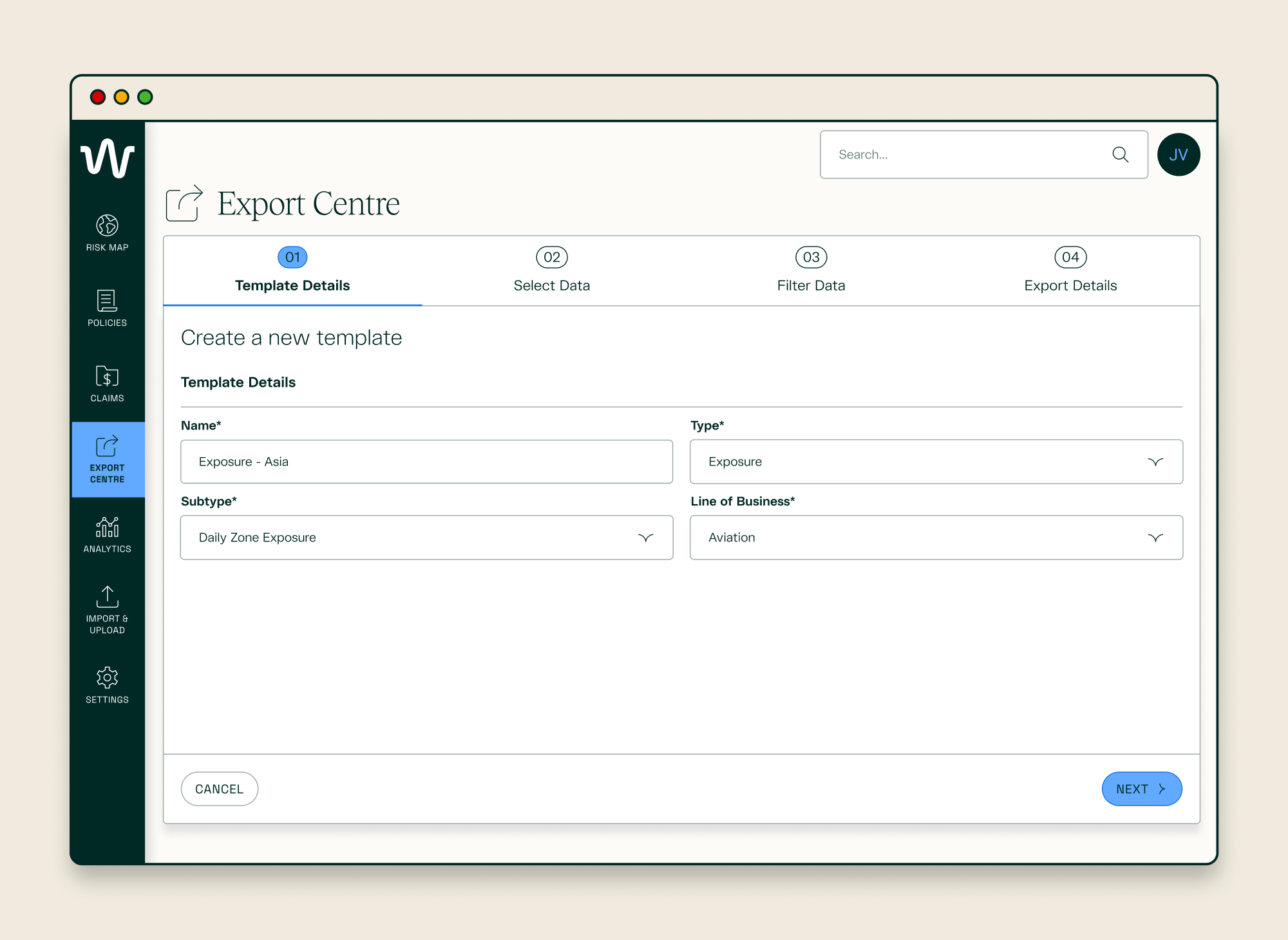
Export Centre - Create Template - Template Details
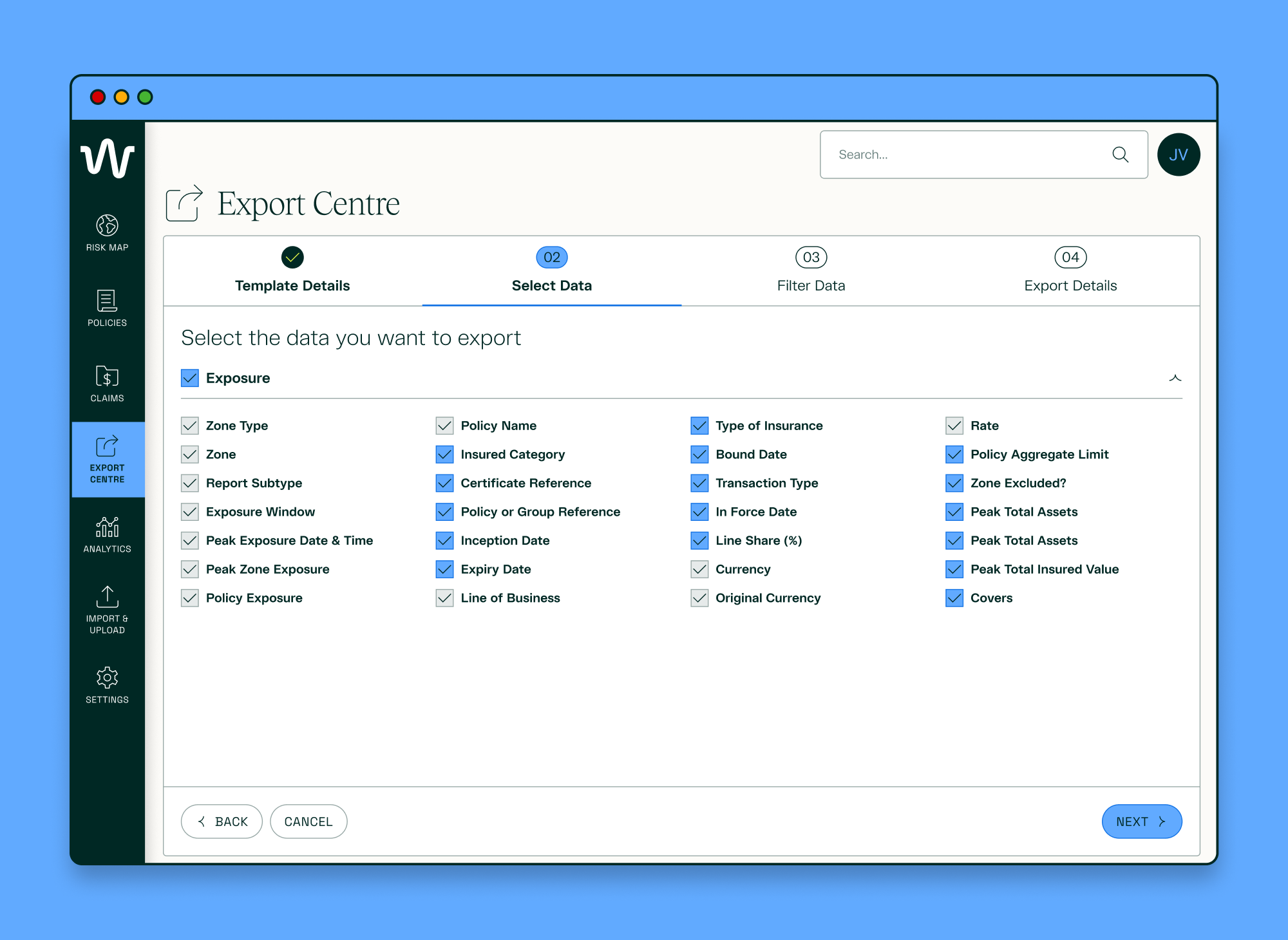
Export Centre - Create Template - Select Data

Export Centre - Create Template - Filter Data
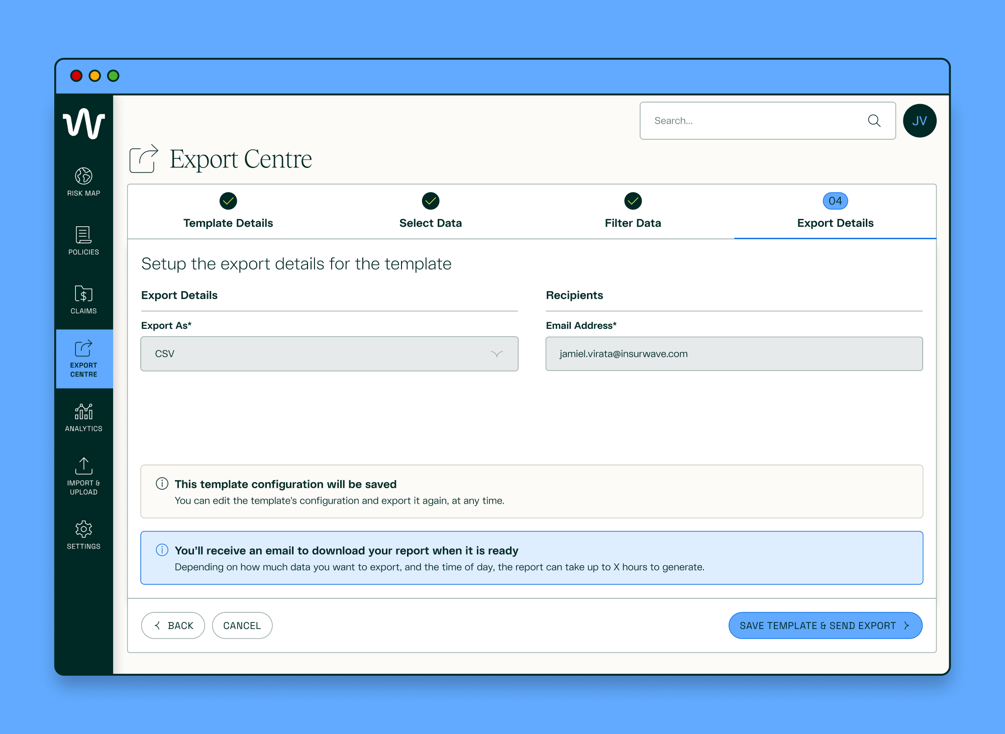
Export Centre - Create Template - Export Details
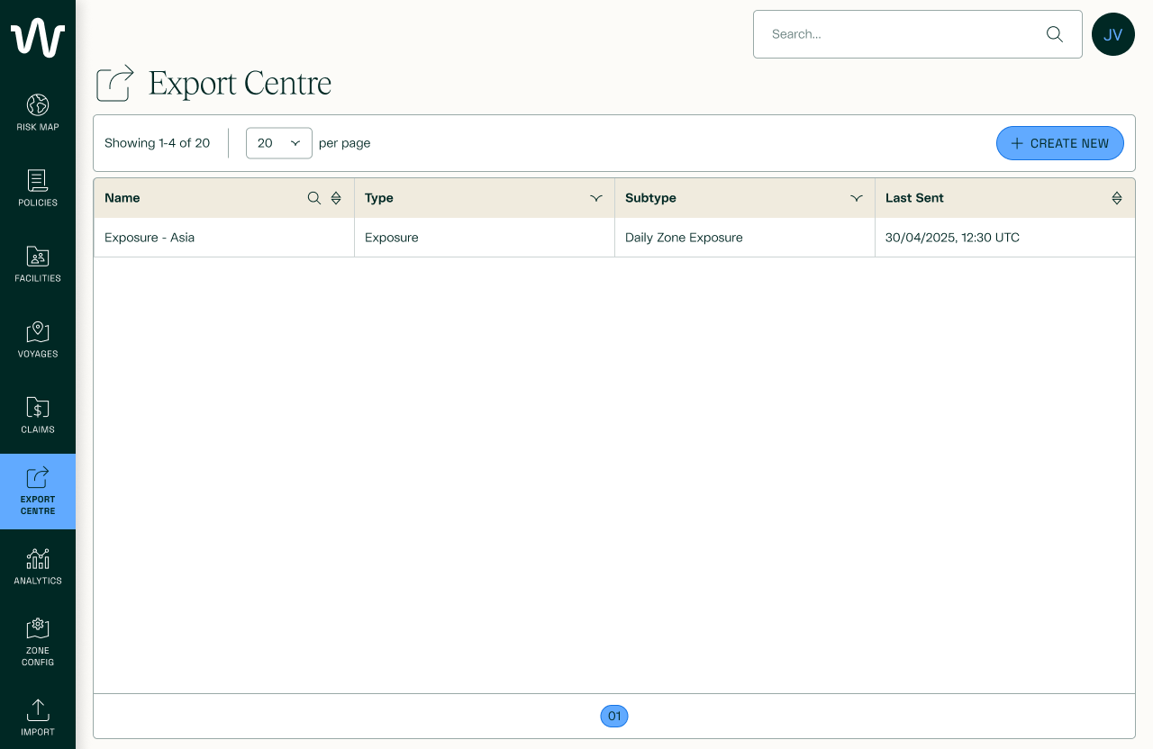
Export Centre - Table
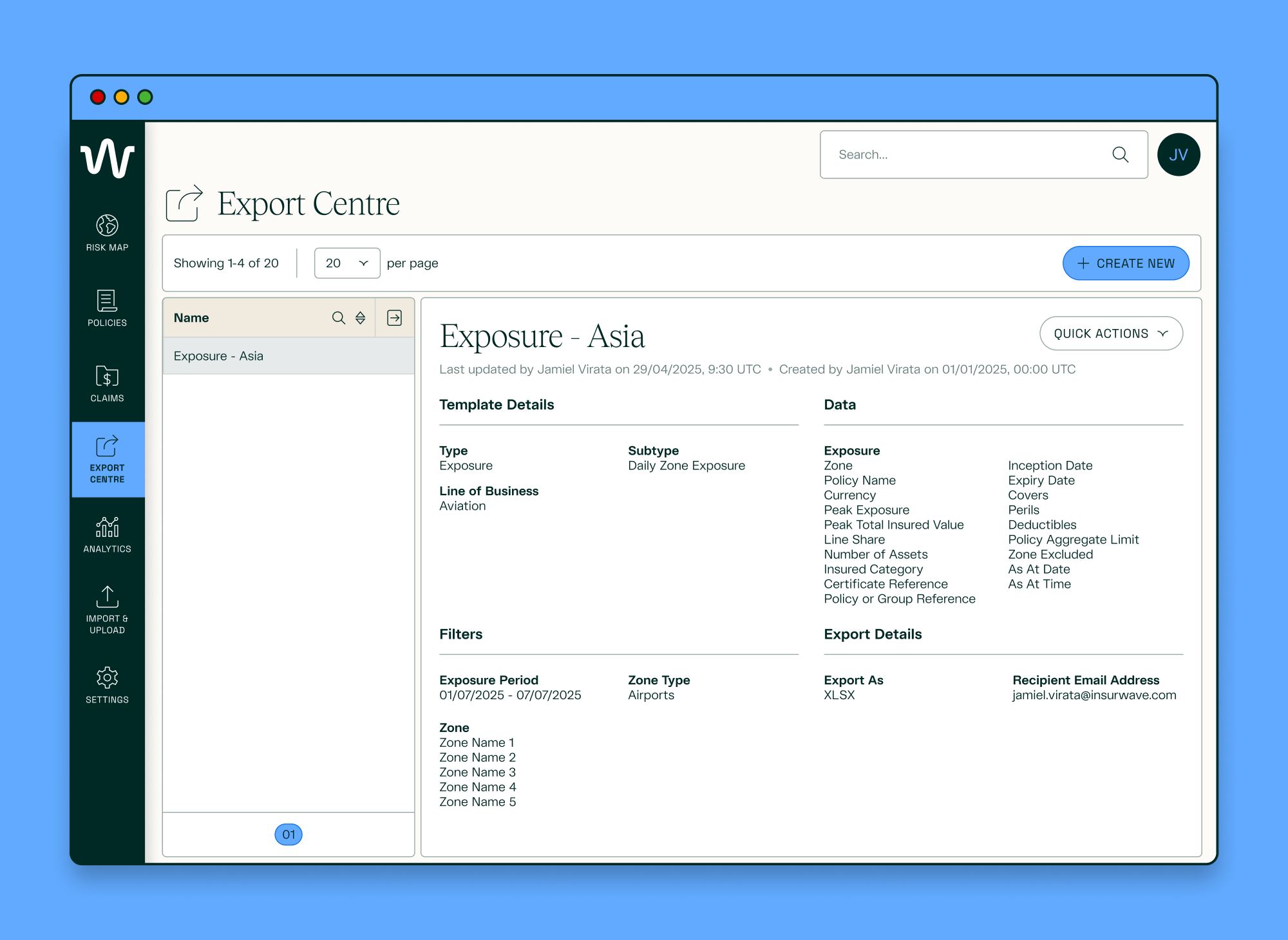
Export Centre - Template Details
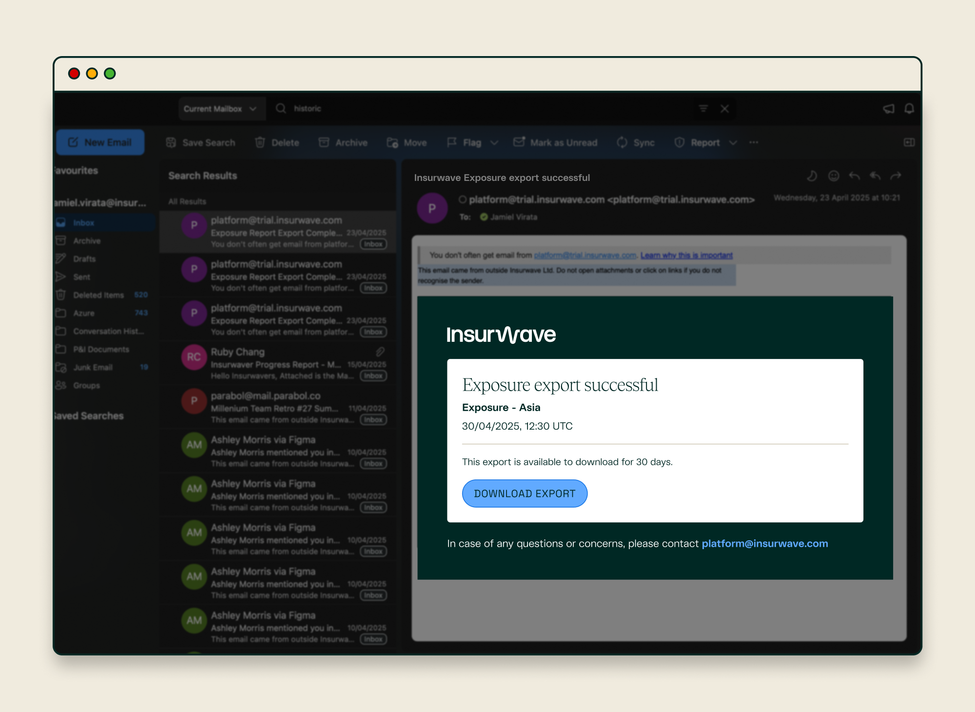
Export Centre - Email - Export Successful
Export Centre - Download
THE PROBLEM
Clients could see their real-time asset exposure on Insurwave, but had no way to analyse how that exposure had changed over time. Without historic, policy-level data, they couldn't spot short-term risk buildups or make fully informed underwriting decisions — so many were exporting or requesting data manually, or relying on external dashboards outside the platform.
goal
Enable 50% of Aviation Exposure clients to self-serve historic exports within 3 months, reducing manual data requests to the Client Success team by 65%.
results
CLIENT ADOPTION
54%
7 out of 13 Aviation Exposure clients have used the feature within the first 3 months of the feature’s release
manual data requests
-78%
to the Client Success team requesting Historic Exposure ranges
RESEARCH & DISCOVERY
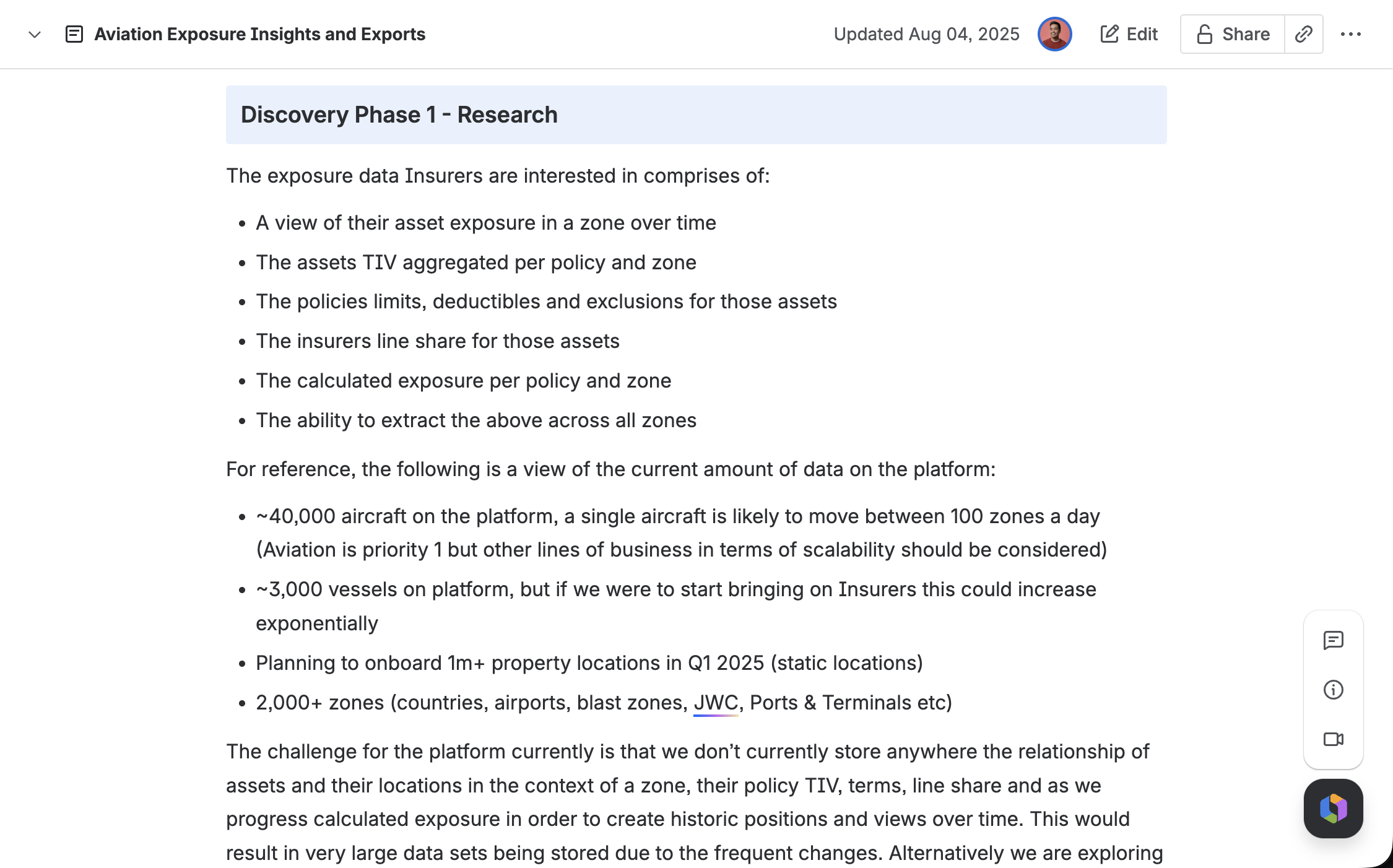
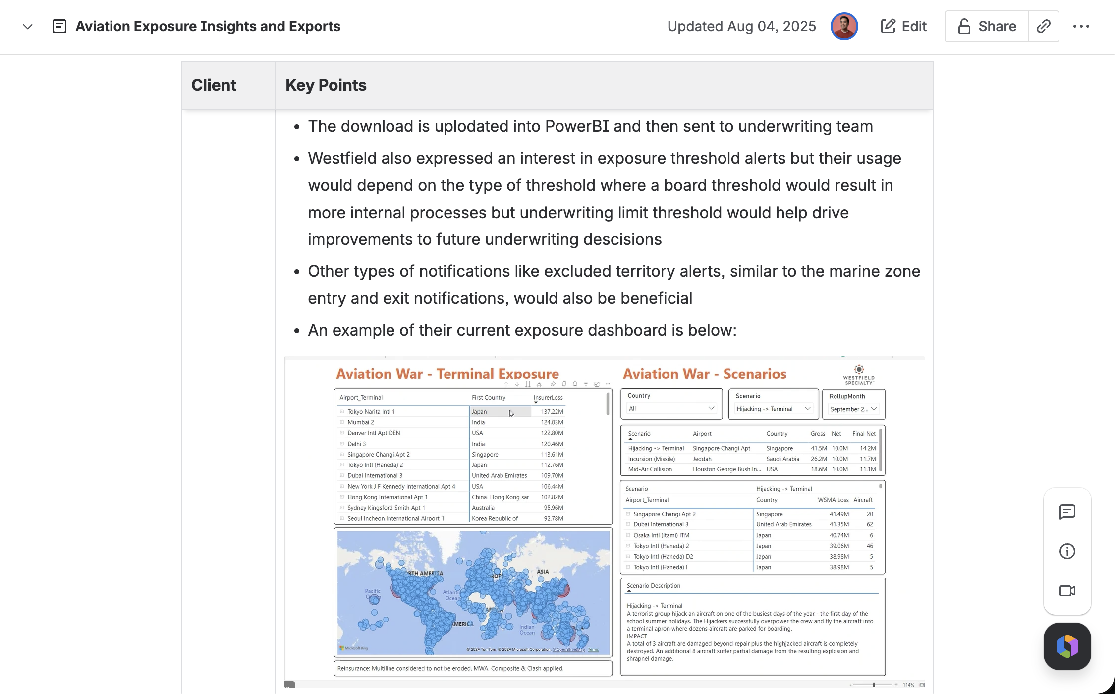
Through surveys and stakeholder workshops, I identified three distinct client segments:
No historic data access at all
Partial dashboards missing key data points
Full external dashboards that Insurwave could potentially replace
Designing a single export flow that served all three — without overbuilding for the smallest segment — was the central design challenge.
This segmentation led me to design a configurable template system rather than a fixed export, so segment 3 clients could replicate their existing external reports inside the tool with ease.
constraints
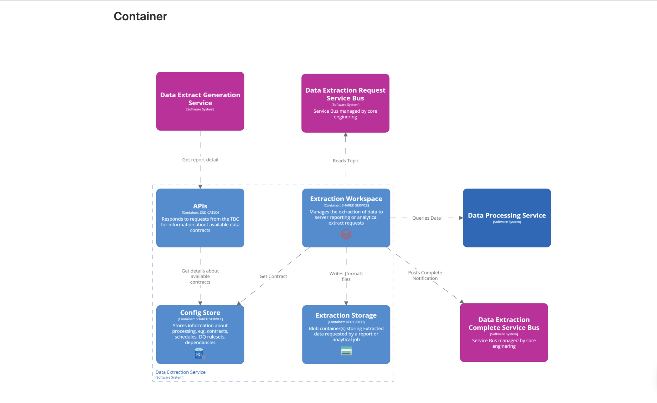
A new backend Data Estate was being built in parallel, requiring tight coordination with the Data team on service ownership and data availability.
To prevent performance and cost issues, exports were capped by the number of zone types a user could select at once — a constraint I had to design around rather than hide, so users understood why a limit existed rather than hitting a wall.
Timeline pressure meant early screens reused existing design-system components to move fast without sacrificing consistency.
Design Decisions
Scope change — scheduling:
A scheduling feature was initially designed to help the Data Estate anticipate load, but was cut when the Data team scoped out the development work and would delay the planned release for months.
This meant that the flow had to be redesigned: the Sending Details and Scheduling toggle were completely removed, and I added a new Export Details step at the end of the flow which would have the ‘Export As’ field and Recipient Details instead.
The ‘Export As’ and ‘Email Address’ fields were to be read-only for MVP, but allowed the design to be future proofed when the other report types were to be consolidated into the Export Centre.
I also took this as an opportunity to add summary info messages at the end of the flow, to set the expectations of next steps for the user.
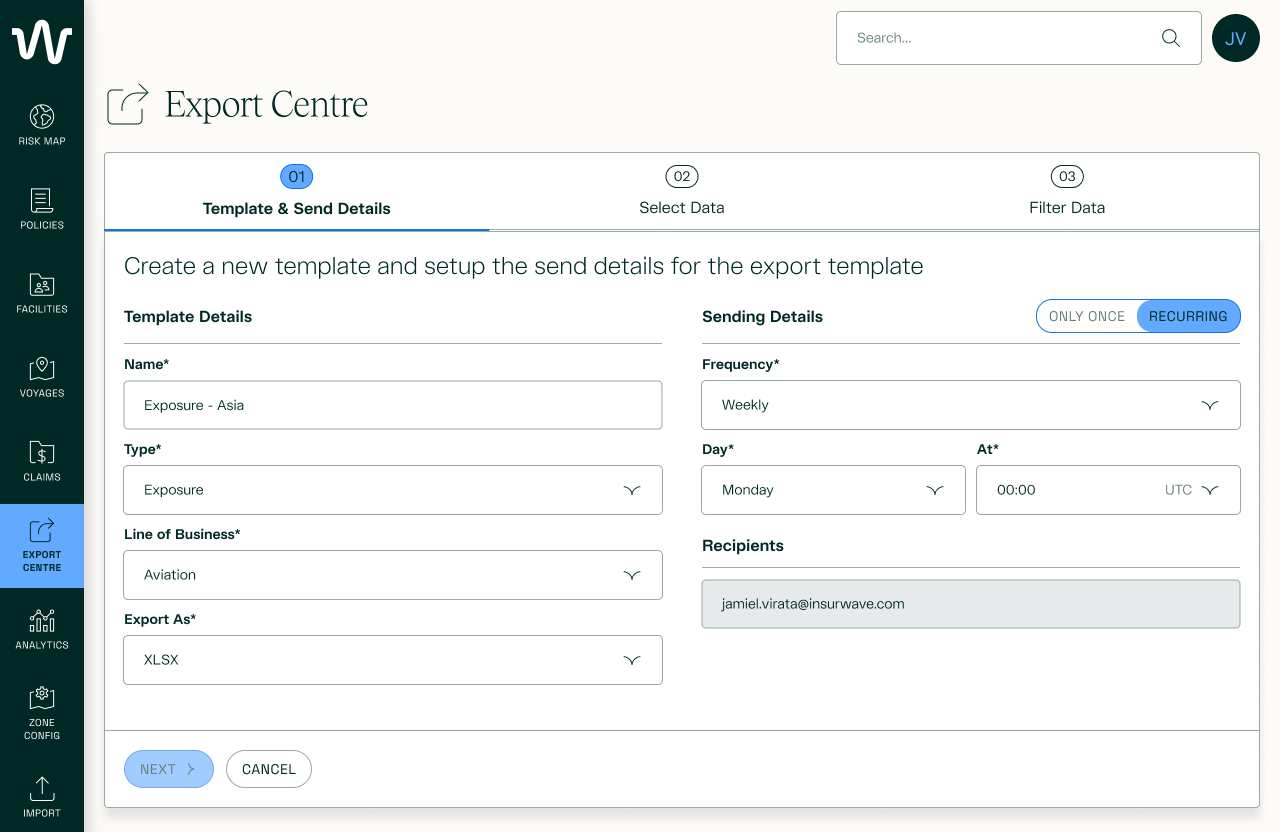
Initial design including scheduling
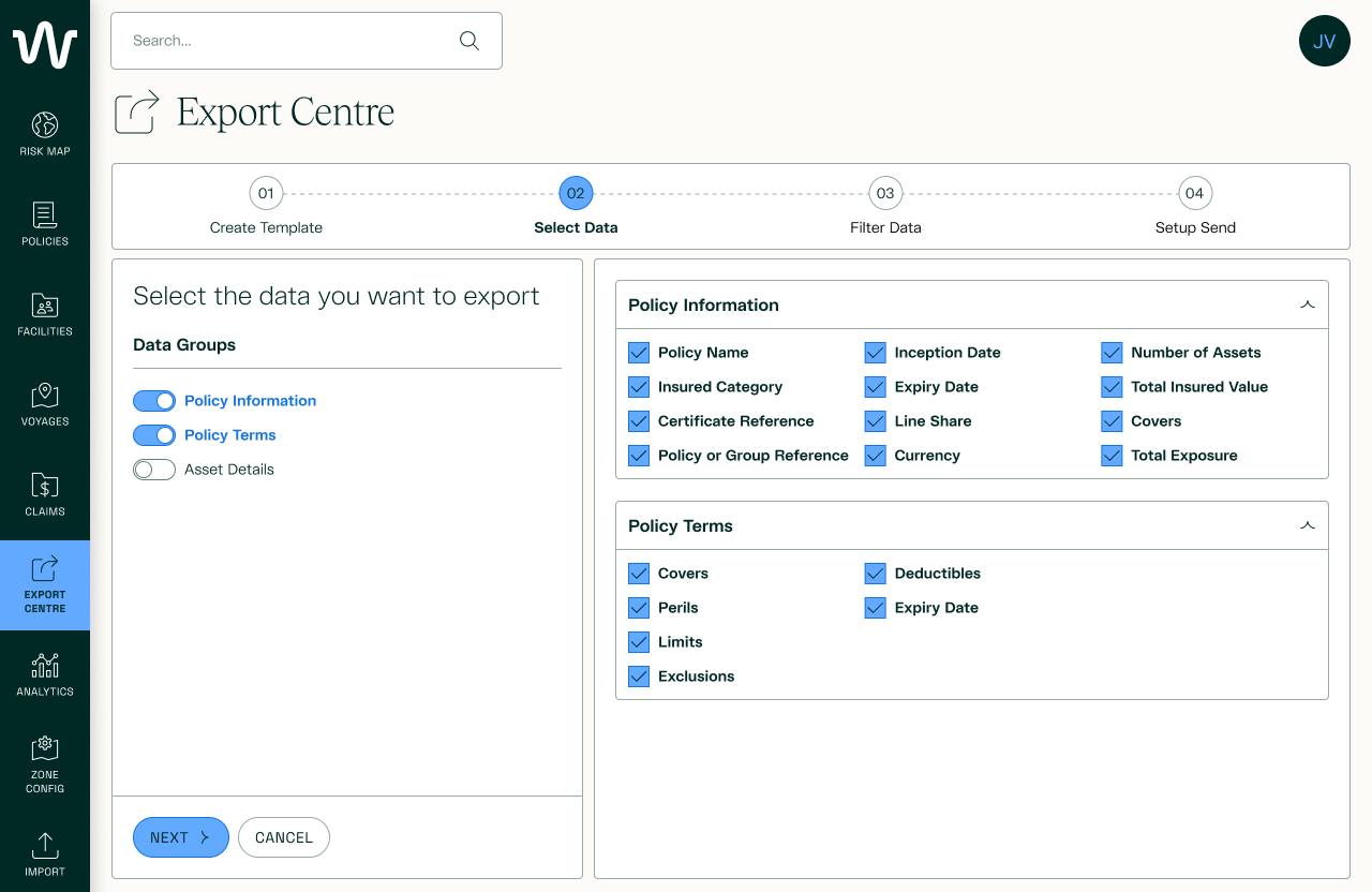
Initial design grouping data columns into their respective tabs
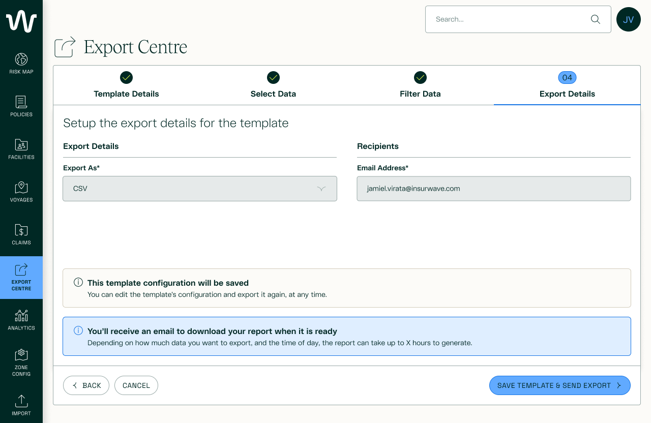
Final design with new final step field grouping and info messages
Select Data change
This Historic Exposure Range export was originally planned to match the existing Historic Exposure Point-in-Time format: an XLSX with multiple tabs, but the Data Estate team found that XLSX row limits couldn't handle the potential export volume, forcing a switch to CSV — which doesn't support tabs, breaking the original design.
I redesigned the Select Data screen around the new CSV structure, working within a column order set by the Data Estate's existing contract (built to mirror clients' current Exposure reports). Mandatory fields were scattered throughout this order rather than grouped together. I pushed to move all required fields to the top for better UX, but that would have disrupted the established output order — since preserving that order mattered more, I conceded and left the mandatory fields interspersed.
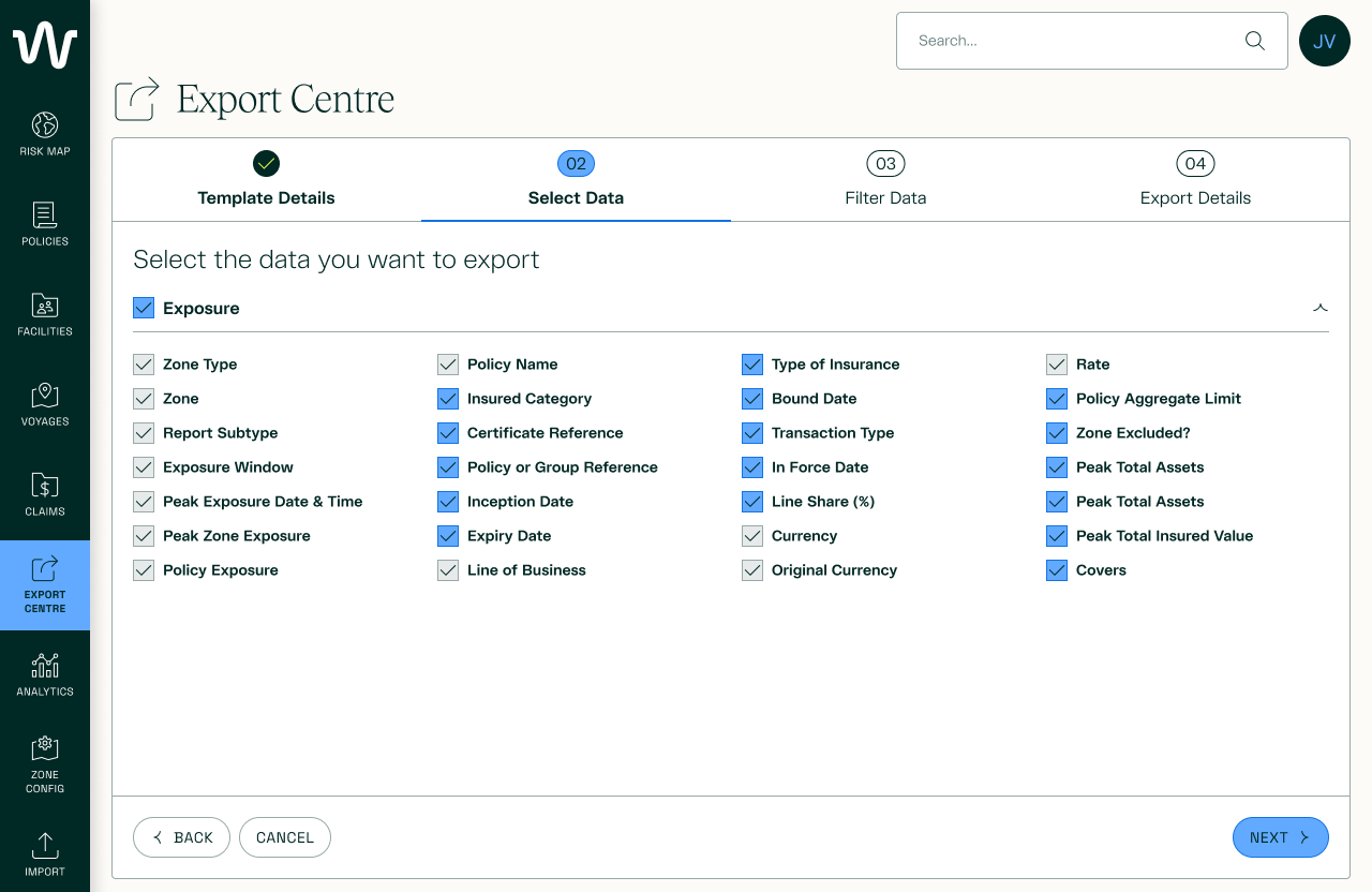
Final Select Data design for Exposure
Filtering Data change
The Filter Data step was originally optional and offered the most customisation, letting users filter their data freely. As the Data contract changed (including the two updates above), Data Estate proposed moving all filtering into this one step for simplicity — but I pushed back, arguing some filters fit more naturally elsewhere (e.g., Line of Business belonged with Type/Subtype in Template Details, not here).
Once we capped exports to one Zone Type at a time, that became a mandatory filter — which in turn made Zone and Exposure Reporting Period mandatory as well. Combined with time constraints that pushed optional filtering to a Phase 1 release, the Filter Data step ended up acting and looking very different from the original.
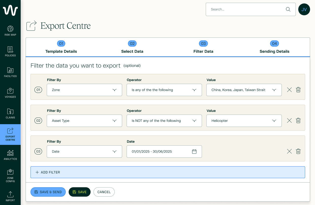
Initial design - Optional filter step using existing components

Final design - mandatory filters required for Exposure export
validation
Due to time constraints and pressure from existing clients that were promised this functionality already, we ran quick usability testing with a client from each segment before release.
“This looks great and exactly what we’ve been asking for, for months. Keen to get our hands on this finally.”
Segment 1 Client
“Looks good but can we customise the order of the data columns so it matches what we put into our downstream systems already?”
Segment 2 Client
“We’ve already got something like this, but if we had an API we could link our forecasting system into, this would be quite useful in saving us some time.”
Segment 3 Client
From this quick round of validation, we wanted to get our Segment 1 clients to a better position with data, so that we could iterate and provide value for all our clients through stages.
Although our Segment 3 clients weren’t going to receive the most valuable releases until later, this set us up so that we could get there in the future, and quicker than before.
stakeholder management
Shifting requirements — driven by new revenue ideas and technical discoveries mid-project — repeatedly pulled the design away from the original goal of user flexibility. I set up recurring alignment meetings to make sure decisions weren't made without the people closest to the user need in the room, and kept refocusing the group on that need when miscommunication between stakeholders started to delay the Data Estate build and the wider timeline.
results & learnings
results & learnings
results
CLIENT ADOPTION
54%
7 out of 13 Aviation Exposure clients have used the feature within the first 3 months of the feature’s release
number of exports generated
100+
since February 2026 release
manual data requests
-78%
to the Client Success team requesting Historic Exposure ranges
usage behaviour
Usage spiked around real-world events (e.g., conflict in Iran and Lebanon), with the heaviest use in April–May 2026 — suggesting the tool is being used for timely, event-driven risk analysis rather than routine reporting.
LEARNINGS
validating technical feasibility
There were a lot of decisions made which resulted in cutting or descoping features due to technical restraints or time, so validating these and scoping them out properly before designing would have saved everyone involved a lot of time and effort trying to balance everything that was being asked.
communication is key
Due to misalignment between key stakeholders, this delayed the progress of the Data Estate being set up and in turn, delayed the entire project.
As the only designer on the project, I had to remind everyone what the overall goal was for this feature and to consider everyone’s perspectives, but to keep the user at the centre of everything.